Bloomberg Mobile Redesign
UX design / Usability Testing / Scrum / User Research
Motivation
Out of 300K Bloomberg terminal users, 200K users are eligible for using mobile application, while only 100K users are actively using mobile app in reality. Noticing there is 100K untapped clients for mobile, goal for this large scale project is to increase the adoption rate of mobile application by engaging them with timely and relevant content with navigational efficiency. To achieve these goals, 5 major areas of improvement were developed - Today view, Global search, Create, Menu and on-boarding experience.
Framework Exploration & Assessment
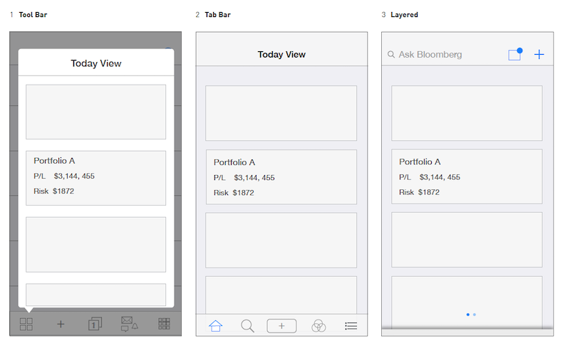
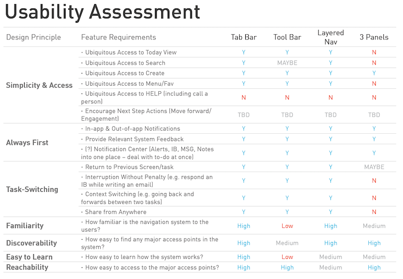
3 framework models - tool bar, tab bar and layered concept - were suggested and investigated. Compared pros and cons of each concept and direction. In order to pick one winner, usability assessment is conducted against design principles and associated feature requirements among product, engineering and design team. Tab bar model is chosen as global direction.
Today View
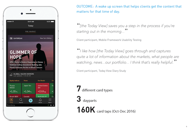
Today view is card based content delivery system on Bloomberg professional mobile application. It is geared towards to support financial specialists’ early morning hours to be more productive and get ready for the day by providing macro market information overview.
- Type of cards : news, market, economic release, economic events, daybreak.
- Time of delivery varies depend of the type of cards. For example, daybreak is delivered 5:30am in the morning and stays in the view for 4 hours until market opens. Once market open, it is removed from the view. All content is accessible via menu.
- Type of cards can be configured by users - if certain types of cards are not relevant to some users, they can turn them off not to see them on today view at all. This is updated based on finding from usability testing.
- Soft landing for drill in : if user wants to see more details of a card, he/she can tap into more link which will soft land to the content. ‘Back’ key will lead them back to today view.
Global Search
Global search entry point is located as second tab on the newly introduced bottom tab. It allows users to run search as well as commands such as TOP to launch top news stories. This search will accept natural language search input, example searches helps to guide users how to leverage.
- Bookmarks
- Security comparison
- UX templates for best, better, good matches
Create
Create button is located in the center of bottom tab allowing users to create new message, new notes and chat with help desk via instant chatting. This will facilitate faster communication for better efficiency.
- Slide down to save daft
Menu
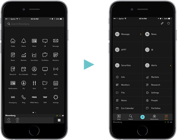
Updated menu moved away from icon grid style menu to avoid hunt and peg issue, supporting two column grid. This allows full customization of menu items of their location as well as sizes. Access to help desk also supported and log out also maintained as in the old menu grid.
- Menu re-arrange
- One-tap resizing
On-boarding
In order to inform drastic updates from old version, on-boarding interactive video is designed and implemented. This is shown when application is first launched after app updates from app store. It is also re-playable under settings for later reference. We collaborated with marketing team for final terminologies used for each section.
- Today view
- Global search
- Create
- Menu editing
Post-Launch Metrics
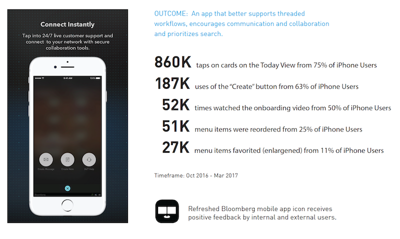
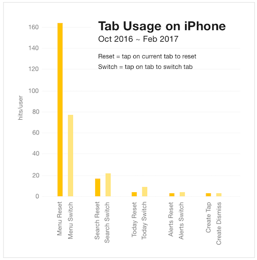
After new framework being release to all users, I have collected quantitative metric from implemented metric and qualitative feedback from client outreach to measure our success. New framework is accepted very positively for most users, numbers from metric also support the same.
Take away
It is always satisfying experience to hear positive feedback from users after launching a product. We’ve been very agile in terms of updating user’s feedback, i.e, during usability testing sessions, quick fixes were made on site since we had all teams - product, engineering and design available during the entire testing sessions.