UX For Aging Tech Generation
UX design / Brainstorm / Project Coordinating / Wireframe / OKR
Background
The primary goal of the effort is to identify opportunities to make the Samsung mobile experience easy, attractive, and indispensable for the senior audience by introducing new, novel features to the platform. Samsung was looking for killer features/application for their next generation flagship smartphone devices. I was a project manager of this project, involved in all activities and overseeing process and quality, making sure we met the due date.
Planning
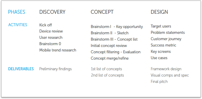
The entire project was broken into three phases - discovery, concepting and design with much focusing on concept phase to ideate, iterate and refine the concepts we will build.
Persona
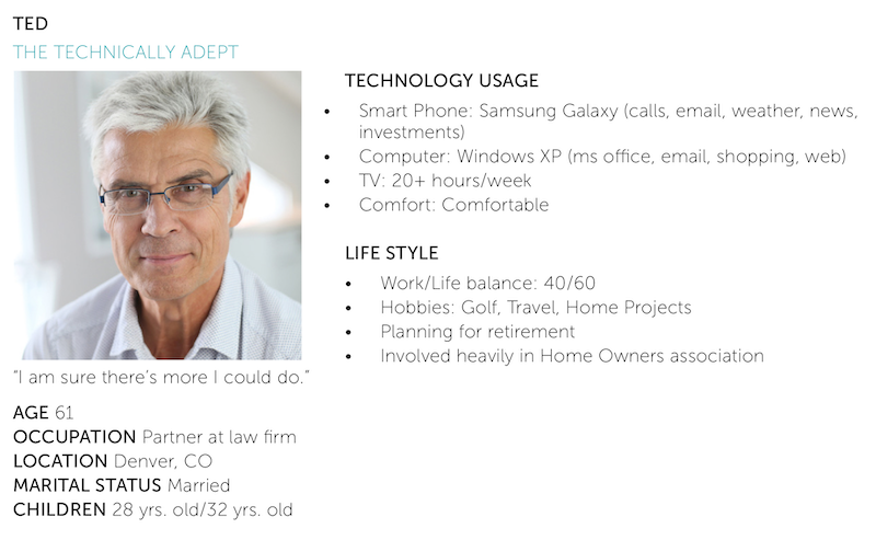
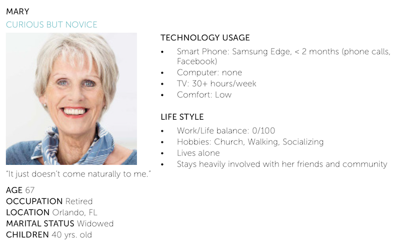
Based on demographic requirement from Samsung, two main personas were created targeting both tech savvy and close to novice users within specified age range.
Problems
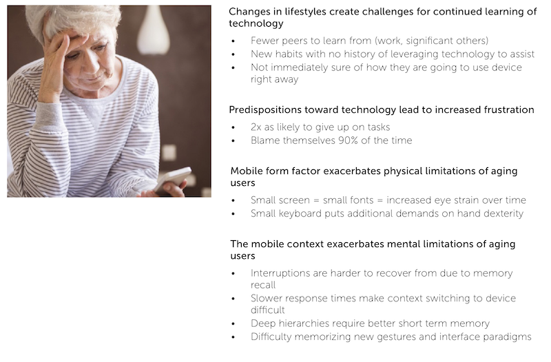
What we found was that there exists 4 primary components making large-scale adoption by the audience difficult; changes in lifestyle, predispositions towards technology, and the mobile form factor and context itself. The following illustrates highlights of our investigation.
Research
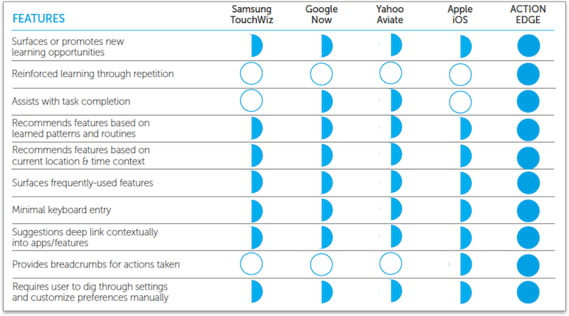
We examined the landscape of current solution to identify opportunities and unmet user needs.
Brainstorm
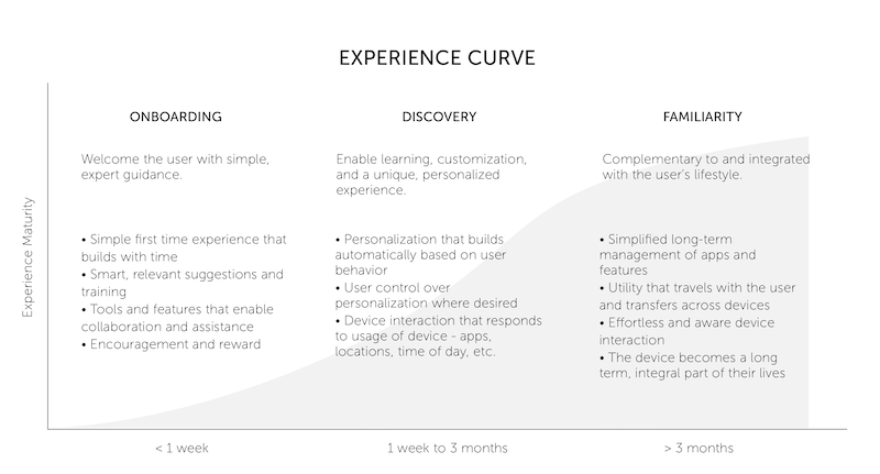
Based on findings from user and competitive landscape research, we explored new feature ideas and mapped on experience curve which was developed to understand best concepts for addressing each experience maturity level.
Principle and metric
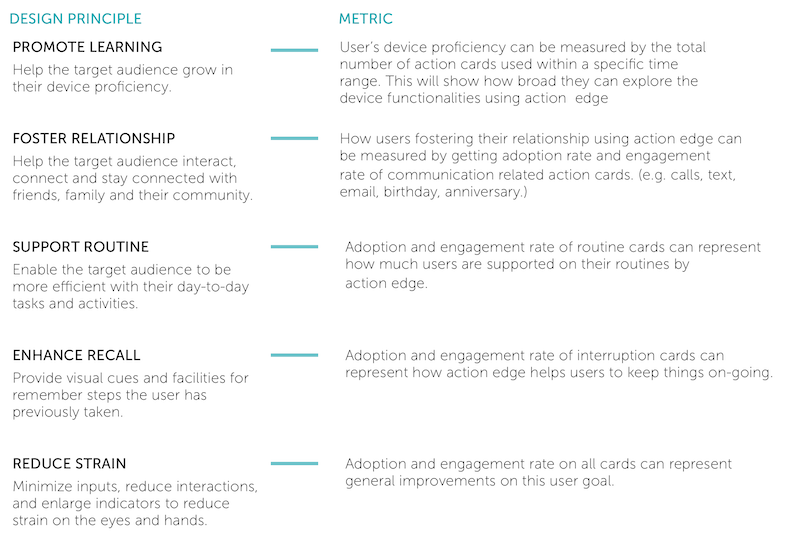
Based on our findings thus far, we developed a set of guiding principles to focus our efforts and ensure our designs addressed the challenges and opportunities the target audience presents us with. And these principles are mapped with actual success metrics to measure the success or acceptance of this concept in the market.
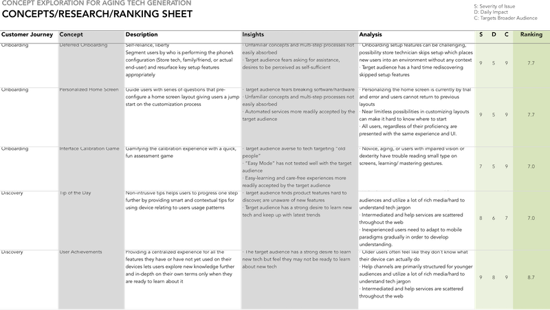
Concept filtering
In order to prioritize the strongest concepts, we evaluated the initial list of ideas based on severity of issue, daily impact and audience coverage. Sum of scores of each evaluation criteria was sorted and decided to prioritize only top 10 concept for further exploration.
Design
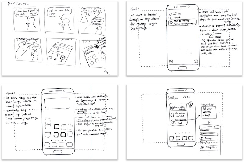
For selected top 10 concepts, we began to visualize them by sketching and add more details to have better understanding of impact to market as well as technical feasibility.
Final winner
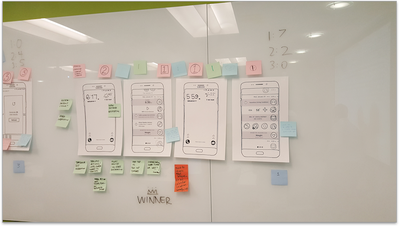
We have further filter down to top 3 concepts and further explore the design details enough to compare those three concepts in terms of market impact and feasibility. We finally selected “Action edge” for final iteration of design.
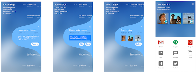
Design specification
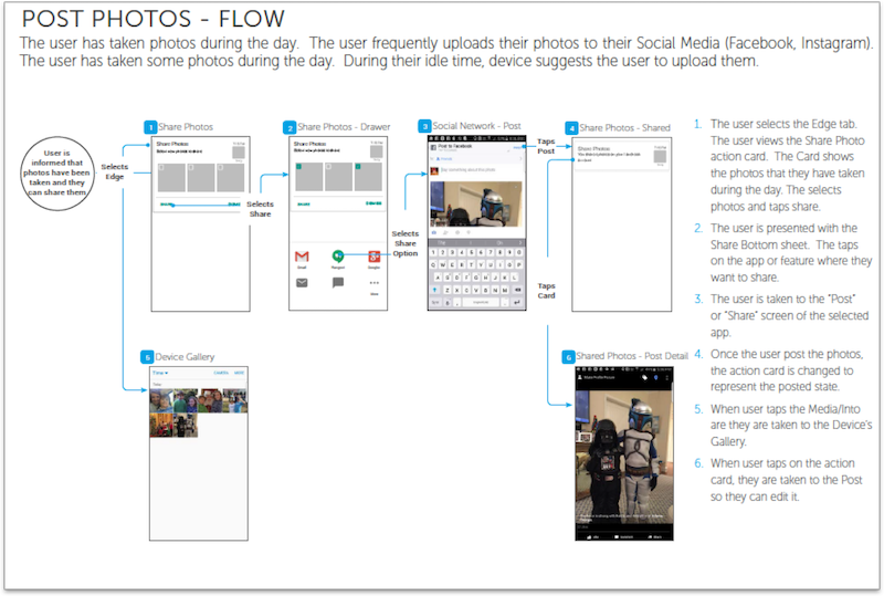
Action Edge is an Edge panel designed to provide quick access to an evolving set of recommended tasks. It deep-links across the devices native and installed apps to surface one-touch actions that are relevant to the user at that place and time. We have provided detailed workflows and specifications on action cards as well as visual design comps and specifications.
Take away
It took us two months to finish this project, it was challenging timeline against what we were asked. It was a great opportunity for me to run the full design cycle from research to specification within compact timeline and learned how to manage priorities given tight timeline.